If there’s a common theme from meeting up with fellow Textpattern architects, it’s one of surprise. The breadth of experience and sheer passion demonstrated by people who use our favourite CMS is both breathtaking and humbling in equal measure.
With street theatre and bustling London market a mere block away, the Porterhouse pub in Covent Garden on a lovely warm afternoon was the venue for what was expected to be a predominantly UK gathering. It turned into anything but, with the international hotbed of awesome outnumbering the indigenous folk 2:1.
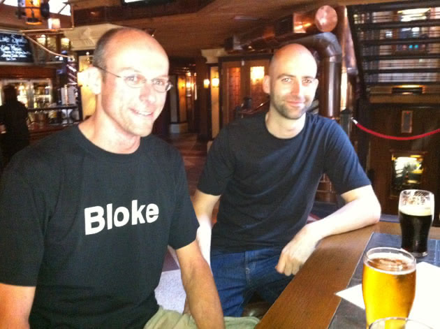
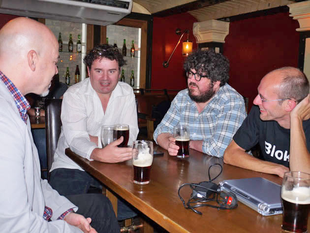
Representing the locals were Bloke (sporting a suitably narcissistic custom T-shirt) and Phil Wareham—author of Textpattern’s new default public side theme as well as chief designer of what will become Textpattern 5’s admin-side. Not only was event co-ordinator, content, design and documentation guru Destry also in the house, we were visited by Anton (mistersugar)—a fellow event co-ordinator from North Carolina who snuck away from his science conference to join in discussions—and two cool Canadians who have been Textpattern users from the beta/gamma days and who both knew and had worked with Dean: Les (Lazlo) and Darren (amoredecosmos).
Surely in the presence of such greatness there were going to be some hot topics of discussion, both Textpattern-related and everyday stuff? You betcha!
Modern art is rubbish
What better way to kick off discussions than to paraphrase English pop band Blur and ridicule the questionable output of Jackson Pollock, then turn to figuring out the appeal of other shining beacons of pointlessness such as the MOMA in New York and the Tate Modern a short hop up the road from us. Morbid curiosity, it seems, is the only draw to these places, since the architecture and content certainly aren’t up to much.
But architecture and content are where sites built with Textpattern continually push the quality bar. The variety of scope, layout, operation and design—each site as individual as its designer—is both Textpattern’s blessing and its curse.
Up until a few weeks ago the default public-side theme was pretty much unchanged from its modest beginnings, and almost nobody in their right mind would use it as the basis for a site. Now thanks to Phil’s work, a much smarter front-end is norm. We mused over whether that might mean more people will use it as a site baseline and Textpattern will get a ‘look’ just like the default WordPress blog theme. It seems unlikely at this moment, but time has a knack of telling.
Message in a bottle
With very little to gauge Textpattern’s use in the real world, we agreed it was time for a showcase; a platform to shout from the rafters that we have something to offer the web world. Just going round the table, we estimated there were over 75 sites designed between us, none of which had any big promotion from our central hubs. Just lost among the white noise emanating from the great bit bucket in the sky.
Clearly that’s very wrong!
The community has WeLoveTxp.com of course, and the forum Showcase your Textpattern site but neither are very much in use, nor high profile enough to capture the energy behind the talented people who design with Textpattern. So it seemed appropriate to unveil a few plans for our ongoing marketing efforts at that very table.
Firstly, as mentioned at the last meet, we have secured WeLoveTxp.com. Over the past few months, between various people’s holidays, we have also been beavering away transferring ownership of TxpMag to our servers. After liaising with Alexandra and some other cool folk, and with Robert’s hard work making a new home for it, that is now complete.
Today it might look the same, but I’ve seen the plans for its revival. Destry Wion has agreed to spearhead a complete overhaul of the site’s direction and put together an editorial team to drive fresh content into the mag. And with this new curator and editor at the helm, the mag is going to go places with a proposed quarterly, issue-based format. Other facets like Twitter will be round-the-clock, naturally.
During the Textpattern-wide content trawl that Destry is undertaking we may move a lot of the WeLoveTxp.com content over to the mag to its own dedicated section, or may spruce up WeLoveTxp.com. Or both. Things like the ageing four ‘showcase sites’ on our site may be removed to make way for a Site watch area of the mag that features the absolute cream of Textpattern sites. With focus on high impact, modern (HTML5, mobile-friendly, etc) sites, this area will be a platform for designers to totally show off, revealing stuff about themselves, their tricks, tips, design company, and so forth. Proper editorial content.
This area alone will be a fantastic place to demonstrate to potential clients and site architects the breadth of possibility that Textpattern can bring to the table. I’ll leave it to Destry to outline the plans more fully as they firm up, since it really will be his ship. Needless to say he’ll be looking out for regular contributors and people to work on the site, content, and graphics so if that’s your thang, raise a hand.
Weapon of choice
As the beer flowed, the conversation became more animated and it was wonderful to behold the fire people hold for Textpattern; in Les and Darren’s case since the early part of this century as they were probably the first people besides Dean who tried it.
There are areas for improvement and we all know that. Some things really need to die, other things need tweaking, and some things totally don’t make sense. Like that curious setting in preferncess labelled “Ping textpattern.com”. Nobody—me included—knows what it does or where that ping ends up (if anywhere). It hits an RPC endpoint somewhere on the Textpattern site and that’s where the trail goes cold. From a marketing standpoint, it would be great if we could resurrect it; if only to give us some indication of Textpattern usage. Otherwise it should be removed.
Darren also brought up some excellent points about the comment system and threw some curve ball ideas about offering integration—either via a plugin or in the core—with other comment systems like Disqus. After all, it could be a barrier to adoption for people who may be itching to get away from another CMS but don’t want to lose their comment base or would feel hampered by Textpattern’s, arguably limited, commenting scope.
One interesting thing was the fact that all of us at some point had successfully managed to convert people from almost all other Content Management Software out there after demonstrating Textpattern’s simple workflow and tag-based approach. People had been converted from Joomla, Drupal, MovableType, Blogger, even Textpattern’s closest relative ExpressionEngine… but hardly any from WordPress. That probably says more about the loyalty of the user bases than I can imagine, yet proves that Textpattern does have something unique that captures the imagination of designers. We just need to get the word out.
Digital love
With the pub’s free Wi-Fi overheating from all the fruit-based devices around the table, Phil showed off some of the first mock-ups of Textpattern’s proposed new interface. Still in keeping with the light, breezy and unobtrusive UI that makes Textpattern what it is, we’ll be focusing more on getting stuff done from more places; for example, adding categories from the Write panel instead of having to switch tabs halfway through editing an article.
It seems the old textpattern.org chestnut remains a bone of contention by all and is still a mess. While I demonstrated the new look and workflow to some favourable comments, it needs the undivided attention of someone with a better eye for style than me behind the scenes, so please shout if you want to be part of it: I’ll give you a peek beneath its broken wing with the goal of helping nurse it back to health.
The pub itself became rowdier as the rugby got into full swing, and Anton made the mistake of tweeting his location; his science conference buddies were then onto him and demanded his safe return from our clutches.
Even as the pub filled, the conversation zig-zagged effortlessly between design methodologies; template systems; harnessing the power of Google Forms; anecdotes on dealing with those difficult clients; and airport design. As evening approached it seemed there just wasn’t enough time to get through everything we wanted to chat about. I could have stayed there for hours more. After all, it’s not often I get to rub shoulders with people who have a Kevin Bacon Dean Allen number of “1”—and the fact Les had organised his holiday so he’d be in the country specifically for the meet was just astounding.
Although we didn’t mention The Daily Mail at all (ahem, no, honest) and I never got to drop my favourite math-based joke…
Bartender: “Is that your pint, Mr. Heisenberg?”
Heisenberg: “I’m not sure.”
…we did get a few photos, so I’ll leave you in their capable hands instead. Please consider organising meet-ups in your local area or when travelling. I cannot recommend highly enough how cool it is meeting like-minded people face-to-face: it’s a fascinating way to spend an afternoon. Good health to all. ?
